• Work
  • About
Menu

JOSE DIAZ

  • Work
  • About

Mexican-born, London-based Art Director / Designer exploring

the intersection between branding, digital storytelling, and

artificial intelligence.

I combine over a decade of design experience with a deep

curiosity for emerging creative technologies, developing

hybrid workflows that merge human intuition and generative

systems to push visual boundaries.

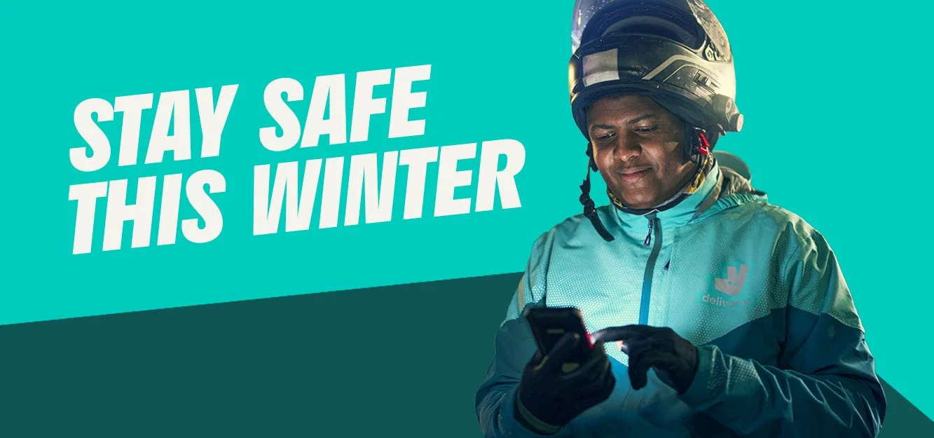
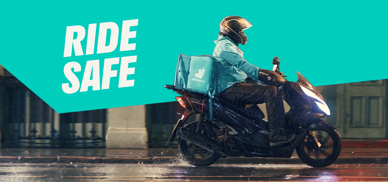
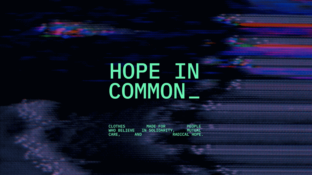
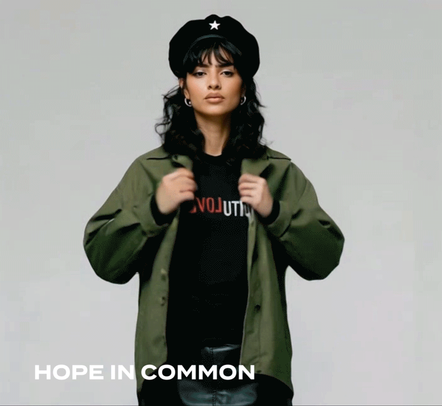
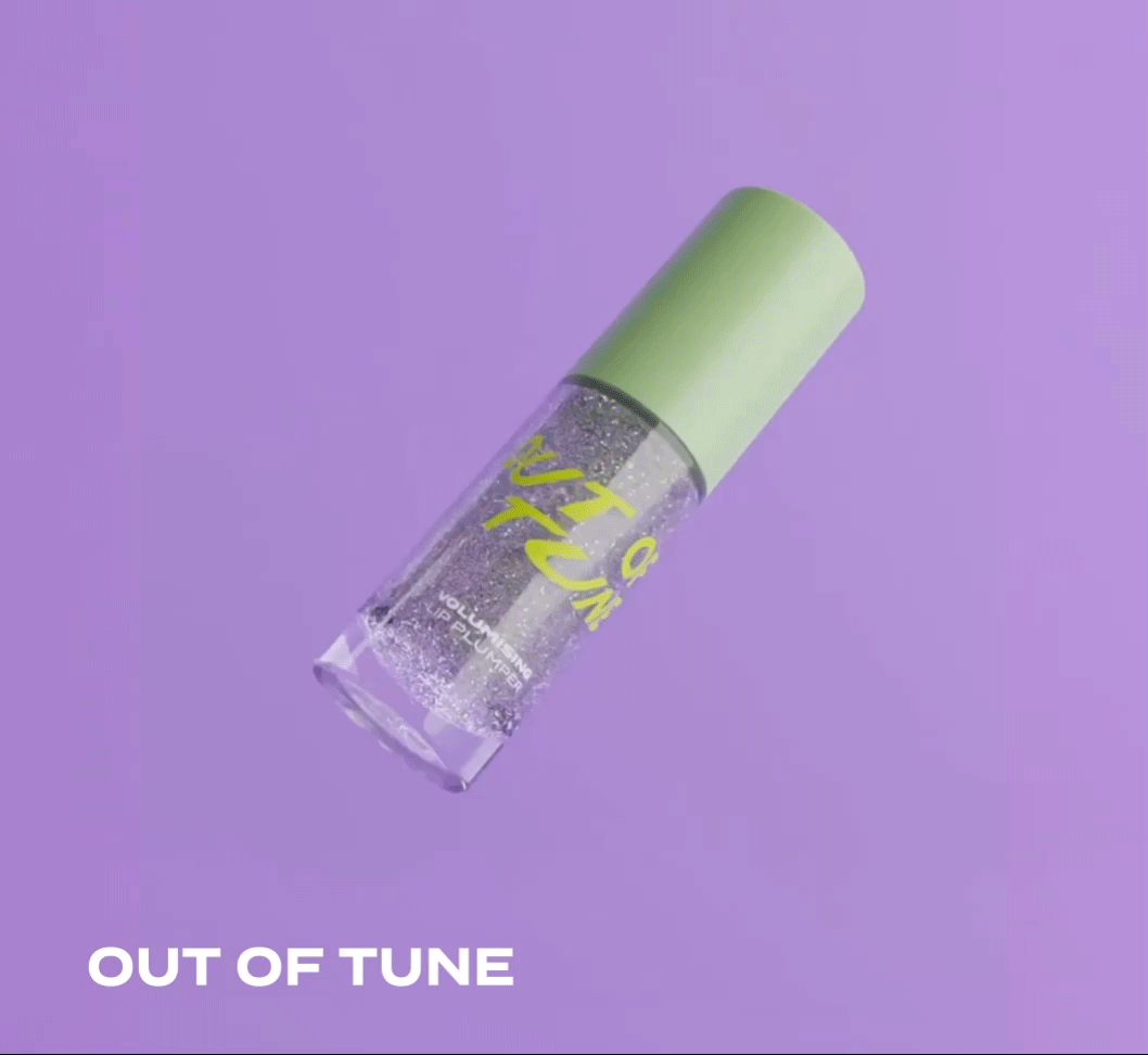
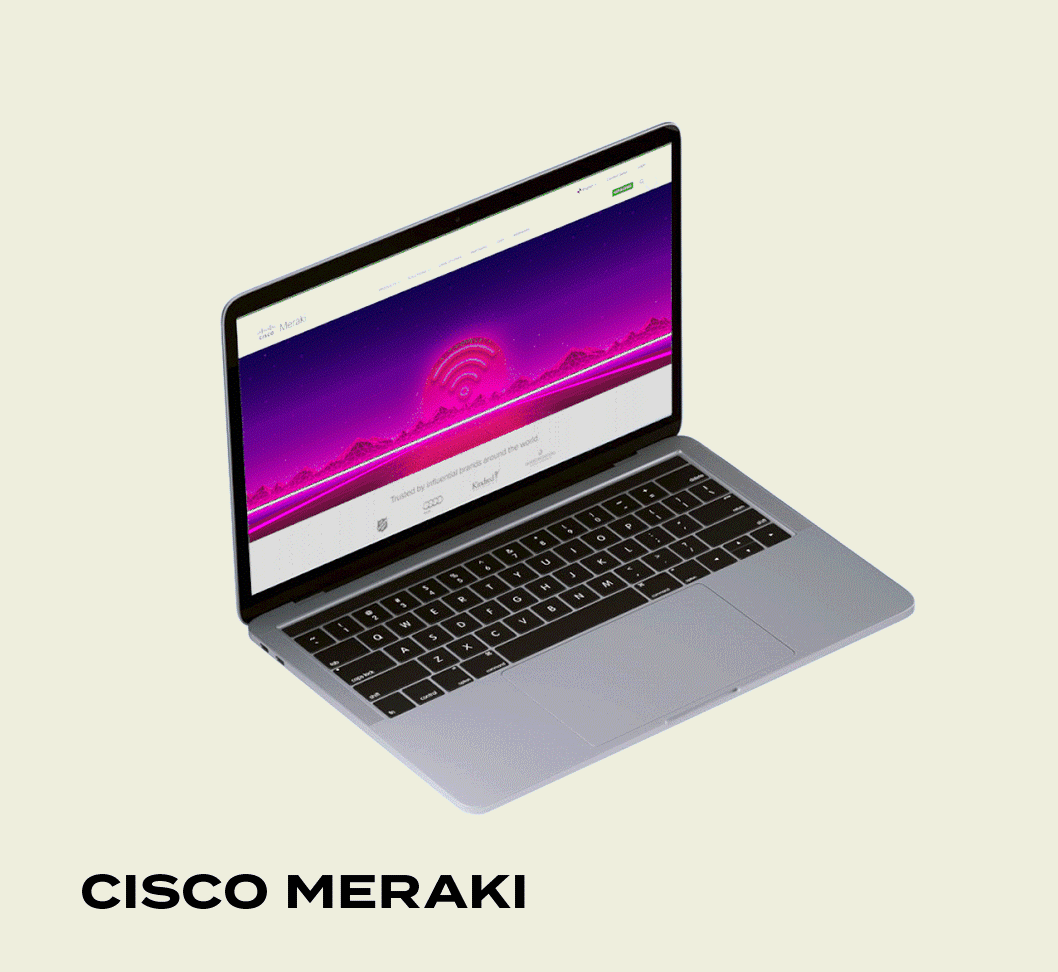
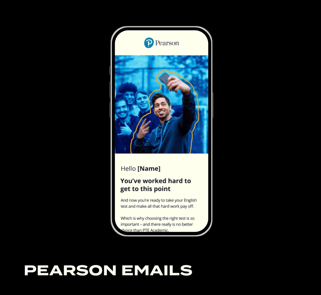
I’ve led global campaigns, rebrands, and digital experiences

for brands across automotive, tech, fashion, lifestyle,

and beauty — and I’m passionate about using AI as a design

partner to make creative production faster, smarter, and

more experimental.


DELIVEROO WINTER RIDERS

Branding / Design / Art Direction

The "Winter Riders" campaign for Deliveroo was

conceived with the aim of promoting safety and

awareness among food delivery drivers during

the challenging winter months. Focused on

encouraging Deliveroo riders to prioritize safety

checks such as inspecting tires and testing

brakes, the campaign aimed to enhance their

preparedness and caution on the roads.

Through a series of visually engaging graphics

and informative content, the campaign not only

highlighted the importance of these

precautions but also underscored Deliveroo's

commitment to the well-being and professionalism

of its fleet. By fostering a culture of safety and

responsibility, "Winter Riders" not only aimed to

ensure a safer work environment for drivers

but also projected Deliveroo as a brand that

prioritizes both its workforce and

community safety.

deliveroo_social.jpg
WINTER_RIDERS_email_header_3.jpg
210524_Deliveroo_Shot_13_0136_LR.jpg
Ride_safe.gif
210524_Deliveroo_Shot_18_1016_LR.jpg
210524_Deliveroo_Shot_24_6963_LR.jpg

HOPE IN COMMON

Art direction / Branding / AI / E-commerce

Hope in Common is an independent clothing brand

I co-founded to explore the intersection between

design, culture, and activism. Built around the

idea of using fashion as a subtle form of protest,

the brand combines bold graphics with minimal

streetwear silhouettes to communicate progressive,

left-leaning messages in a stylish Y2K wearable

way. From concept and branding to art direction,

photography, and e-commerce design, I developed

the full visual identity and creative direction

for the label. Each piece like The Future is

Female, Revolution Love, or Teenage Riot embodies

the spirit of collective optimism and resistance

that defines our generation. The project also

extends into digital campaigns and social

storytelling that position design as a catalyst

for social awareness and change.

video_1.gif
Artboard 2-100.jpg
Artboard 5-100.jpg
Mockup_05.gif
Artboard 1-100.jpg
Artboard 3-100.jpg
Artboard 6-100.jpg

OUT OF TUNE

Creative direction / Branding / Packaging


Social / 3d / AI

Out of Tune is a playful beauty brand I designed

from the ground up, aimed at a Gen Z audience

with a love for Y2K aesthetics, pixel pop culture

and bold self-expression. The brand’s identity is

defined by a fresh green and purple colour palette

paired with glossy, energetic visuals that

highlight its hero product — a volumising lip

plumper available in a range of iridescent shades.

I developed the full visual language and digital

ecosystem, creating TikTok-style motion assets,

packaging renders, social content, and the Shopify

e-commerce experience, shaping a brand that feels

nostalgic, internet-native and fun.

Artboard 1-100.jpg
Artboard 1 copy-100.jpg
Artboard 3 copy 2-100.jpg
OOT-phones_motion.gif
Artboard 3 copy-100.jpg
Artboard 3-100.jpg
Artboard 6-100.jpg

PERSIL VARZENAL CUP

Experiential Activation for Persil

This project reimagined the spirit of grassroots

football and Brazilian “varzea” culture through a

bold, immersive brand experience for OMO (Persil).

My role focused on visual direction and spatial

design — creating a dynamic environment where

typography, color, and texture celebrated the

raw energy of play. The space merged analogue

and futuristic worlds: from industrial laundromat

setups to robotic paint applications and AI-

assisted installations. Every design element

from the modular signage system to the

red-and-white visual identity was crafted to

amplify OMO’s message that “Dirt is Glory,”

transforming mess into a badge of creativity

and human connection.

Artboard 4-100.jpg
Artboard 5-100.jpg
Artboard 1-100.jpg
Artboard 2-100.jpg
Artboard 3-100.jpg
Artboard 6-100.jpg
Artboard 7-100.jpg
Artboard 8-100.jpg
Artboard 9-100.jpg

PLOOM HORECA

AI Art Direction / Concept Design

For the Ploom Aura Horeca Toolkit, I led the

AI-driven concept design and visual art direction

for a collection of premium brand touchpoints

across lounges, restaurants, and beach clubs in

Saudi Arabia. Ploom Aura is a next-generation

heated tobacco device, positioned as a refined

lifestyle accessory rather than a traditional

smoking product. Using advanced generative

workflows, I developed a cohesive visual language

inspired by luxury materials, sensorial lighting,

and architectural form—reflecting Ploom’s vision

of sophistication and exclusivity. The visuals

present bespoke environments and branded objects

such as mixology bars, charging totems,

glorifiers, and sculptural scent domes, all

rendered through AI and refined in post-production

to achieve a photoreal, aspirational finish. This

project demonstrates how AI-assisted design can

bridge industrial design, interior storytelling,

and brand identity into a seamless narrative

of modern luxury.

Artboard 1-100.jpg
Artboard 3-100.jpg
Artboard 4-100.jpg
Artboard 5 copy-100.jpg
Artboard 5-100.jpg
Artboard 7-100.jpg
Artboard 8-100.jpg
Artboard 9-100.jpg

SPACEMAKERS

Art Direction / Branding / Design / Motion

SpaceMakers is a community-building initiative 

at Hogarth Worldwide that supports black and 

minority ethnic people, mental health, celebrate 

cultures, promote change, and provide a safe 

space for dialogue.

The branding concept of SpaceMakers as 

depicted in the logo revolves around the 

interplay of space within the typography. The 

key elements, especially the unusual spacing 

between letters and the stylized gaps in some 

characters, visually represent the idea of 

creating or holding space. It uses negative 

space and creative typography to symbolize 

openness, inclusivity, and transformation.

Spacemakers_motion_1.gif
spacemakers_blocks2.jpg
spacemakers_blocks3.jpg
spacemakers_blocks4.jpg
spacemakers_blocks5.jpg

CISCO MERAKI

UI Design / Web design / Marketing campaign

This campaign for Cisco utilises a futuristic 

and vibrant aesthetic, drawing on themes of 

connectivity, progress, and innovation.

This design effectively combines futuristic and 

technological imagery with a clear message 

about cloud-managed wireless connectivity. 

By evoking a sense of progress, exploration, 

and potential, it positions Cisco as a forward-

thinking company ready to lead the next phase 

of digital and wireless evolution. The retro-

futuristic style adds a creative edge to the 

campaign, making it stand out while still being 

professional and focused on the message 

of innovation.

cisco_laptop_mockup_1.gif
Wireless_campaign_banner.jpg
Web-1920-wireless.jpg
_tetris_3.gif
business_landingpage.jpg

PEARSON

UI Design / Email design / Marketing campaign

Pearson is the UK's largest awarding 

organisation offering academic, vocational 

and work-based learning qualifications.

The design concept behind these email 

templates is centered on creating an 

engaging, youthful aesthetic by utilizing 

colorful blocks to break up content in a 

visually appealing way. This block-based 

layout makes the emails more digestible 

and approachable, aligning with a younger 

audience that values clarity and simplicity. 

Each block is distinct, filled with vibrant 

colors like yellow, pink, and blue, which not 

only draws attention to different sections 

but also helps segment the information into 

manageable, easily scannable chunks. 

The use of bold, high-contrast backgrounds 

enhances focus on key elements such as 

calls-to-action and important messages, 

ensuring that the content stands 

out effectively.

PEARSON_TYPE3.jpg
PEARSON_1block.jpg
PEARSON_TYPE2.jpg
PEARSON_TYPE4.jpg

RAW MAG

Art Direction / Illustration / Design


Stop Motion

RAW Mag UK is a contemporary cultural

publication aimed at 25-35 year olds, 

featuring art, fashion, music and current

events. Before launch, I created the whole

visual identity of the magazine, including

the logo and all aspects of the website layout. 

I regularly help with the art direction and

visual identity, by designing social media

material, banners, headings and

advertisements for the publication. 

raw_mag_FINAL.jpg
rawweb.jpg
rawscreen1.jpg
RAW3.jpg
output_XOQvCE.gif
prev / next
Back to Jose Diaz Creative Designer Homepage
Ford_thumb.jpg
0
Ford
Deliveroo_thumb_WR.jpg
6
Deliveroo
HIC_thumb2.gif
7
Hope in Common
OOT_thumb.gif
7
Out of Tune
Persil_thumb.png
9
Persil - Omo Varzenal Cup
PLOOM_thumb.jpg
8
Ploom
SPACEMAKERS_thumb2.gif
5
SpaceMakers
cisco_thumb.gif
5
Cisco
pearson_thumb.gif
4
Pearson
RAW_MAG_thumb.gif
5
RAW
dynata_animation_3.gif
0
Dynata
photography_thumb.jpg
0
Photography

2025 London, UK